Denver Zoo case study
Tool: Figma and UX Metrics
Timeline: August 2023 - December 2023
Roles: UX Researcher / Designer
The Denver Zoo case study explains the design process and user research for the redesign of Denver Zoo’s website, specifically on its ticket flow.
Summary
The primary objective of this case study was to enhance the user flow and elevate the design of the Denver Zoo's website, proposing practical solutions for these issues. The redesign focuses on streamlining the ticket-purchasing process, structuring a more organized navigation bar, tailoring the 'home page' to cater to user needs, and enhancing website accessibility.
Challenges
One big challenge on the Denver Zoo website was the long and frustration of navigating through the ticket pages. The ticket-purchasing process has many unnecessary steps with an inconsistent design system that does not match the rest of the website.
The Denver Zoo website’s inconsistent and overwhelming design system limits accessibility in design with its color combination and cohesiveness.
Research
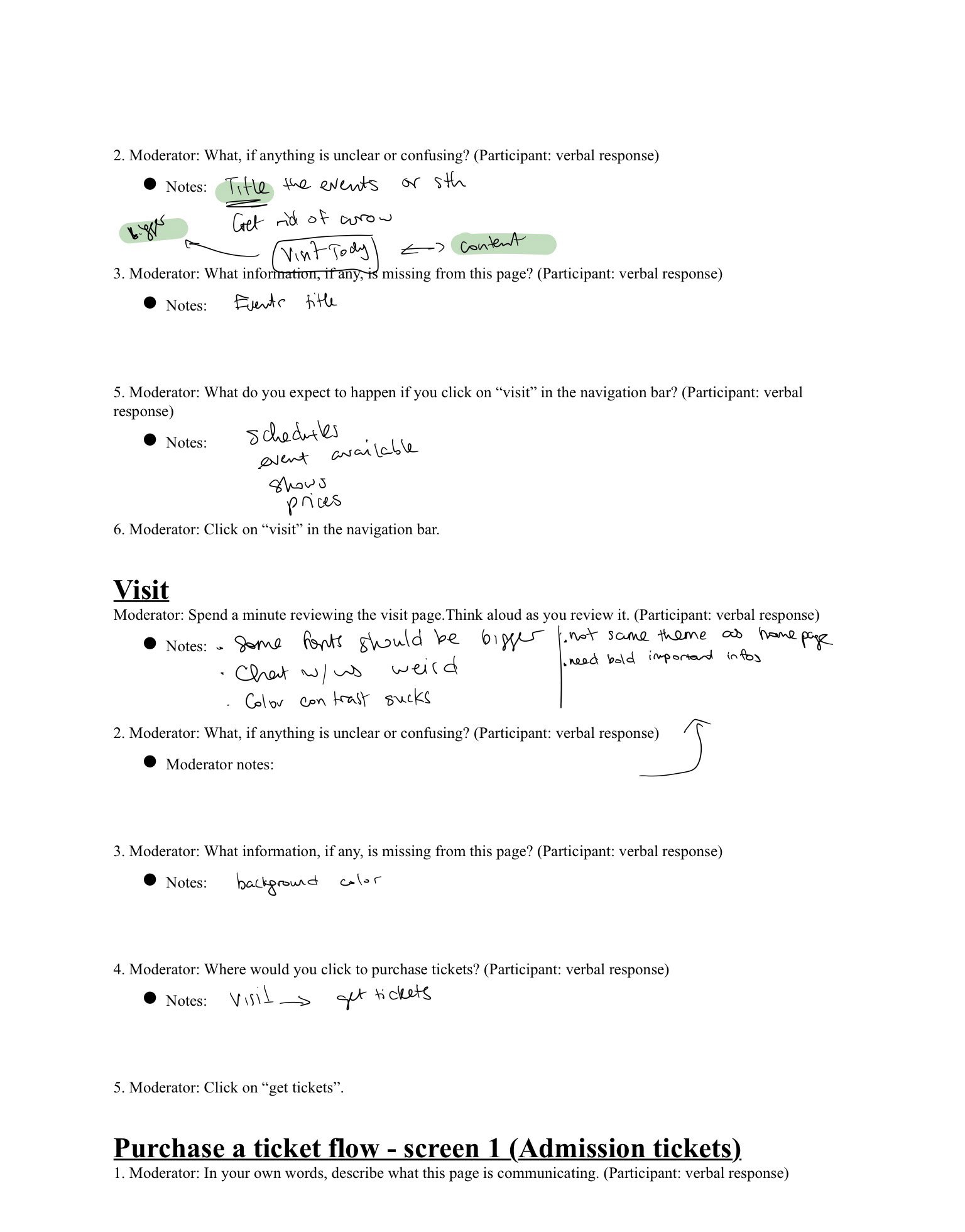
Conducted 4 interviews navigating through the Denver Zoo website, from the Home page to the Visit page to the Ticket-purchasing process. Based on the UX design principles and usability tests, I can identify the current Denver Zoo website’s pain points.
Usability testings
Design analysis
The Denver Zoo's website needs a quick and smooth navigation to purchase tickets because there are many unnecessary steps, inconsistent design elements, and a design system that limits accessibility, preventing users from having a good ticketing experience.
Problem statement
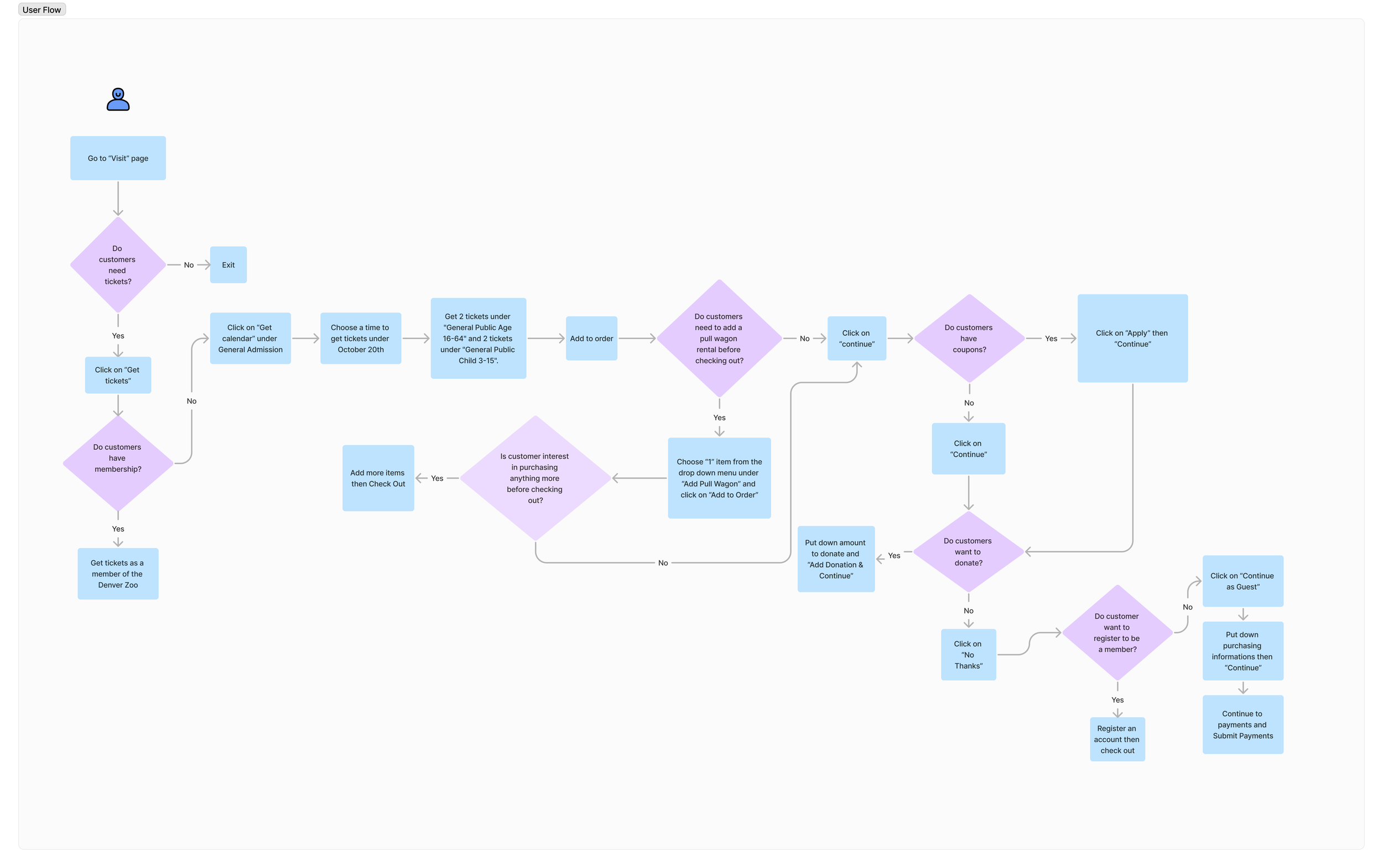
After identifying the problem statement, I created the user-flow map to guide me through the next step, creating the low-fidelity wireframes.
User flow
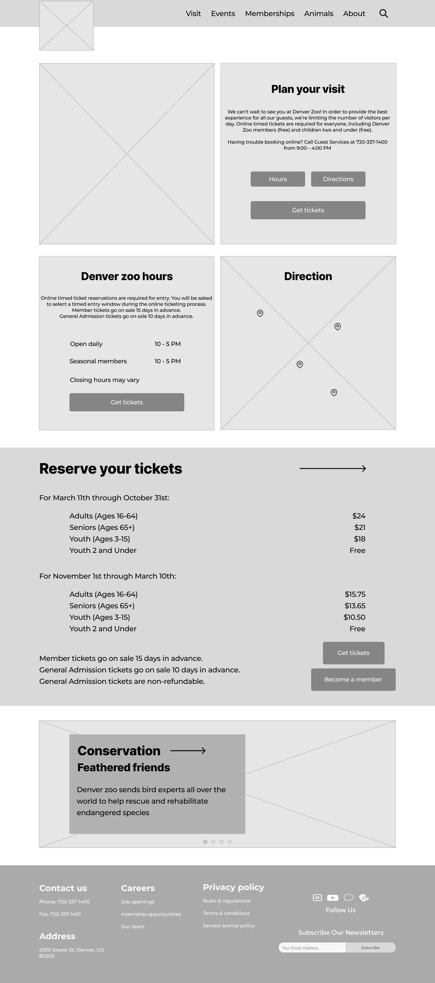
Low-fidelity wireframes
Mid-fidelity wireframes
Final prototype
Professional feedback
Shadow effects on texts are unnecessary.
Centered-aligned texts are not good practice for user readability.
Ticket prices page and additional items should be on one page to eliminate unnecessary pages.
Background boxes around texts are unnecessary.
Inconsistency between prices.
Design feedback
Get rid of most shadow effects on texts to make the text look clearer.
Left-aligned text for readability.
Combine the ticket prices and additional items so users don’t need to click on a new page to add items.
Get rid of unnecessary background boxes so users can focus on the content of the page more clearly.
Add a “cent” value (.00) to stay consistent.
Design updates
Evaluation and results
The first pain point is the calendar missing the legend so users don't know what white and green boxes indicate. Instead of making a legend, I change the color of the unavailability boxes to dark grey and when users choose an available date, it will turn green.
The second pain point was the additional items. Users were confused about what they would get if they chose a specific item and would like a description of each one. To fix this, I would include a description of the additional items to eliminate confusion. To keep the page minimal and not too “loud”, I decided to create a “question mark” icon next to some items so if users are unsure about an item, they can click the icon and learn about it more.
Future plan
My next step would be to conduct more user testing and get more feedback to improve the design of the page. I would also like to implement more effects like hovering state and transitional effects to improve the flow through the pages. Also, I would implement how many tickets are available for visitors to know ahead. I would want to get more feedback and shorten the ticket-purchasing process as much as I can.
Reflection
Through this redesign project, I gained insights into the importance of user testing and getting feedback. Also, I’ve learned many valuable lessons on the UX design principles and have applied my knowledge to this project, improving the Denver Zoo website, specifically its ticket-purchasing process. Another valuable lesson that I learned is that I always need to keep doing tests and improving the design of the website and not just assume that users know what one feature does. Attention to detail and time required to meticulously map out every element, ensure proper spacing and sizing, and ensure the overall flow appears seamless were never up to my concern until now. I will continuously do user testing and get feedback to improve my UX designs.


